Monday, 31 March 2014
OUDF503 the bear design
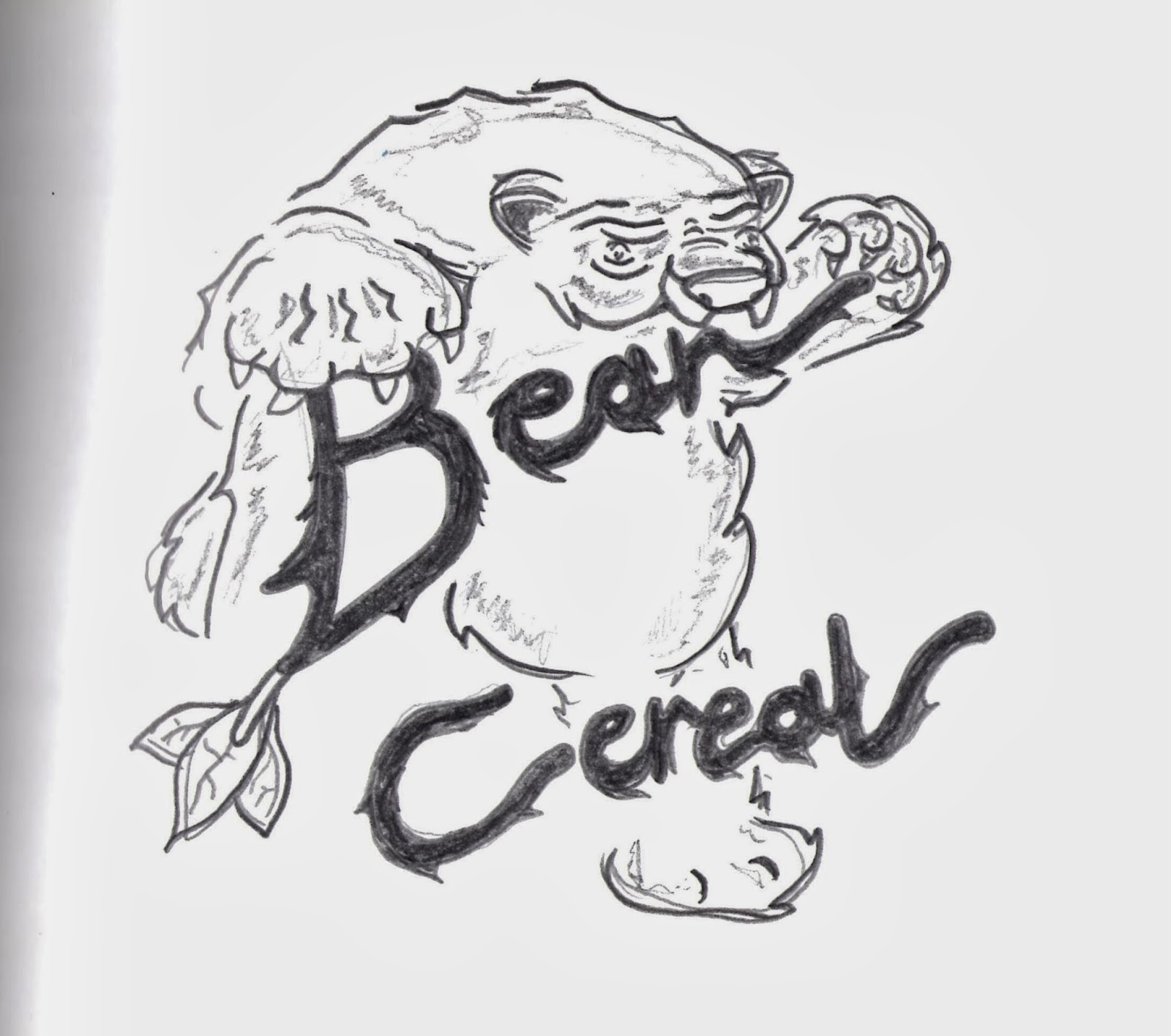
for the bear design i wanted to make him look like a normal bear so that the kids that saw the cereal packet would instantly recognise it so i started with making it look big si then i made him look chunky and fat but that went on to become my love for the logo and the bear itself i wanted him to look like a fat and loving bear so this is how my final design came along the image thats displayed on the bottom is the deign that i had chosen for the final outcome of the bear look and the logo.
OUDF503 my bear and font
the first look at the bear grasping the font was something i enjoyed doing a lot so this came my main look i did for the design of the cereal packet and i really do hope this is coming across how much i liked this it stared with the design of the bear logo and i though to myself why don't i incorporate the bear with the logo itself so i did this by having the bear paws come over the font and start to eat and devour the logo.
OUDF503 my type
the design i did at the top left of the pic i started to enjoy this a lot more than the over design because i wanted the paw print of the bear to be in the font itself so i started my design with hard lines then i want the font to be a bold and a iconic look to it so this i hope came out quite well in the design of it in the brief it states they want a bold font so his is what i went on to make for them.
OUDF503 my design
for my design i started with so block letter for the bear logo so i went onto having it look like a maya or anime style type so i wanted this to come across i my designs i went on to look and design these from what i had been watching and looking at for inspirations and this was something i found hard at first because i hadn't drawn type for many years and i hope that you can see that i have incorporated the bear into the logo itself.
OUDF503 - the bear
for my bear design i wanted to have something look elegant and simple enough for packet so i started to look at comic book and also cartoon bears so i could get a feel of how both of them would come out looking on my design but i didn't want to use too many-heavy lines when it came to drawing it i still wanted the cartoon feel to come across for it.
OUDF503 font types
when it came to me designing the type that i was going to use i stared to look at colour and i wanted to make the colour standout for the cereal packed design so that the child who would be looking at it could recognise it instantly and not have to look at a different design and forget how it looked.
OUDF503 font types
Then from that standing point i went on to look at the type of font that can e used on body tattooing because yet it make look different and in your face it is still a type of font used quite regularly so this came to a shock and owe me because i wanted to use something that could entwine with itself and not have any gaps inside the type itself .
OUDF503 font types
when i frist started using font for the first time i wanted to look at all the types of font that are used today so i looked into the different ones used by disney and i wanted to get that child theme across quite strongly for the project so i had a look at wreck-it Ralph so that i was able to noise how all the types over time have shifted from being just traditional 2D look to a 3D look this came across quite well when i noticed disney have done this by having their designs change a lot through the years.
OUDF503 font types
for this brief i wanted to create a stand out font that would be able to be spotted and noticed when it was first looked at so i came to look at all the types that could be created and i wanted to design something that a child could recognise straight away so this is how my journey stared and what i had looked at and developed for the project
OUDF503 responsive
for the project i decided to work with a brief that i had to create a font and something iconic to go with it so when this came about i went and looked at different types of type and then fonts so that i could come up with a stand out type and then i had to make something iconic to go with it this came a struggle to me but when i read it was called bear i stared to design a bear that could go behind the font to make it look like it was eating the type itself.
Subscribe to:
Comments (Atom)


